Understanding SwiftUI Views
As I continue with the “iOS Developer” career path on Codecademy, I learned and practiced SwiftUI Views. SwiftUI Views are the building blocks of iOS app interfaces. In Swift, a View represents a piece of the user interface and is treated as a “protocol”. This means any struct conforming to the View protocol can be used to build the UI.
The Role of Structs
In Swift, structs are lightweight data containers that can model simple data structures. When building SwiftUI Views, structs are commonly used to create reusable and efficient UI components. Each struct that conforms to the View protocol must include a body property that describes the view’s content.
The Importance of “: View”
When defining a SwiftUI View, you use the “:” symbol to conform your struct to the View protocol. This tells Swift that your struct is meant to be a view component. For example:
struct ContentView: View {
    var body: some View {
        Text("Hello, World!")
    }
}
The “Body” Property
The body property is a required part of any SwiftUI View. It defines the actual content and layout of the view. The body is usually composed of other views and can include layout structures like VStack, HStack, and ZStack to arrange views vertically, horizontally, or in layers, respectively.
View Modifiers
SwiftUI provides a variety of modifiers that allow you to customize the appearance and behavior of views. You can build complex UI elements with minimal code by chaining these modifiers. Some common modifiers include:
.font(): Sets the font of the text..multilineTextAlignment(): Aligns text within a multi-line text view..padding(): Adds space around the view..bold(): Makes the text bold..foregroundColor(): Changes the color of the text or view..border(): Adds a border around the view.
Using the “.” Syntax for Modifiers
When you press the “.” after a view in SwiftUI, Xcode shows you a list of possible modifiers. This makes it easy to explore and apply different modifications to your views.
Layout Structures: VStack, HStack, ZStack
VStack: Arranges views in a vertical stack.HStack: Arranges views in a horizontal stack.ZStack: Overlays views on top of each other.
Additional SwiftUI Components
Color: Defines colors in the UI.Spacer: Adds flexible space between views to control layout.
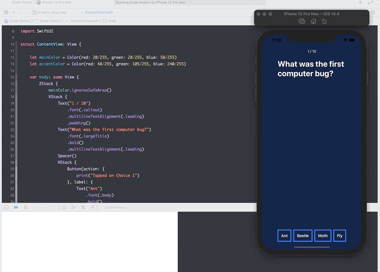
Applying Concepts to Code History App
In the second part of the lesson, I applied these concepts to our Code History app in Xcode. Here’s a GIF of the progress:
Conclusion
Learning to use SwiftUI has been a fascinating journey, gradually bringing me back to design and front-end development. With powerful tools like Figma, which I now have access to as an educator, I’m excited to explore full-stack development in the future, balancing mobile and web development skills. Meanwhile, I’m committed to improving my Swift and iOS development knowledge.
I’m on Day 4 of the #100DaysOfCode challenge and eager to see where this journey takes me next!
SwiftUI Views Summary Table
| Concept | Description | Example |
|---|---|---|
| SwiftUI View | Basic building block of UI in Swift | struct ContentView: View { ... } |
| Structs | Lightweight data containers | struct ContentView { var body: some View ... } |
| “: View” | Conforms struct to View protocol | struct ContentView: View { ... } |
| Body Property | Describes the content and layout of the view | var body: some View { ... } |
| View Modifiers | Customize appearance and behavior of views | .font(), .padding(), .foregroundColor() |
| VStack | Arranges views vertically | VStack { ... } |
| HStack | Arranges views horizontally | HStack { ... } |
| ZStack | Overlays views on top of each other | ZStack { ... } |
| Color | Defines colors | Color.red, Color.blue |
| Spacer | Adds flexible space between views | Spacer() |